Stories from the work

Not every useful piece of work needs a full case study. Some projects stay with me because of one decision, one constraint, or one moment that changed how I think about the work.

Viacar

Modernizing Switzerland's vehicle registration system

ELCA × Viacar AG — UX Designer, 2015–2020

Viacar AG provides IT services for road traffic authorities across Switzerland — driver licenses, vehicle registration, exams, and more. Our job was to take their legacy desktop client, one operators had used daily for years, and rebuild it as a modern web application.

The tender phase happened before there was a contract to design for. I sketched user journeys and storyboards by hand, photographed them, and cleaned them up for presentation — whatever it took to help the sales team make the case to Viacar.

The harder problem came later. The legacy system's screens were dense with closely spaced label-field pairs, and operators had years of muscle memory tied to exactly how that information was positioned. A generic modern form pattern would have made the interface harder to scan, not easier. Instead, the team developed something small: extending each label's baseline into a line running straight to its input field. No new visual element, just a stretch of something already there — and it solved the exact problem operators had lived with.

The project outlived my time on it — Viacar's system has continued to evolve since I left ELCA in 2021.
Coach on Tap

Rebuilding a platform that had already failed twice

Coach on Tap — Product Owner, 3-month engagement

Coach on Tap connects people with coaches — matching, discovery, demo sessions, progress tracking. When I joined, the platform had already been through multiple redesign attempts. The CEO was direct about why: user feedback kept saying the same thing — it simply wasn't usable. Neither previous attempt had fixed that.

Working closely with the CEO and one UI designer, I redesigned and shipped both the marketing website and the core platform over three months — coach matching, demo booking, and progress tracking for coaches and mentees alike.

The clearest signal that it worked came sideways. The CEO offered to introduce me to her network and stayed open to future work. Later, without any prompting, one of the engineers on the team reached out to me directly to offer a Product Owner role — nobody asked him to.

Lausanne Public Transport

Turning a seven-minute ticket transaction into thirty seconds

ELCA × TL — UX Designer

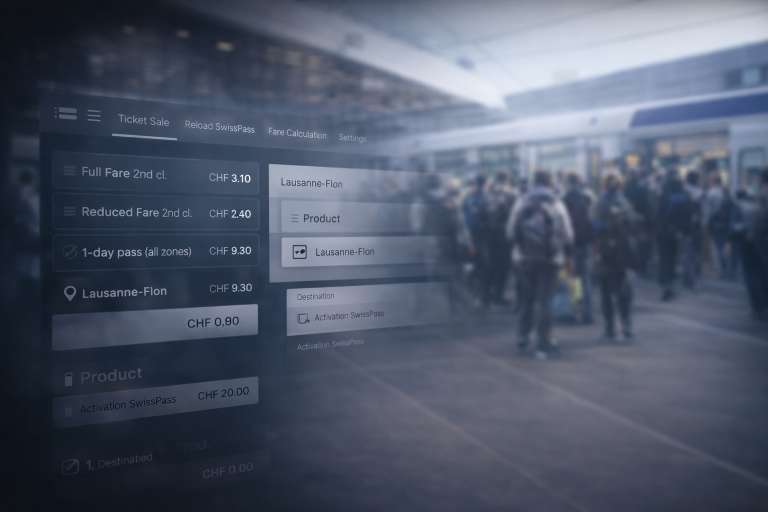
The existing ticketing flow had accumulated enough complexity that a common transaction could take around seven minutes.

The interesting part wasn't removing screens for the sake of making the flow shorter. We had to understand which decisions the system was forcing passengers to make, which ones could be inferred, and where the interface was exposing complexity that belonged behind the scenes.

For the common transaction we focused on, the redesigned flow brought completion time down to under thirty seconds.

That project stayed with me because it was one of the clearest examples of a principle I still use: simplifying a product is often less about designing a simpler screen and more about deciding what the user should never have had to think about in the first place.

Lausanne ticketing interface